jagardn
Airbrush Acquisition Disorder Patient
I got some time this weekend to put together how I used color matched transparent paints.
So many times on the forum, I hear the question about how to make "some color" it may be, Root Beer, Skin Tone, pretty much anything. When asking the question, everyone wants to know the "Recipe" for the color. These recipes never really work out because of the difference in pigment from one vendor to the next, hell, if you use the same paint, but don't shake yours well, the color won't be the same every time.
So.....how do you make Root Beer or a Skin Tone? Exactly the same way you make any other color...Match it!
Since the question was brought up in a recent thread, I will use a reference supplied by @Smiler65, it is a pretty simple image with only a few colors.
Step 1
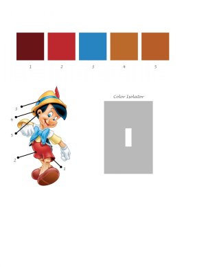
Analyze the image for the darkest portion of a color, in the reference/practice sheet below, I have showed most of the key points to paint this image accurately with just transparent paints. There are 5 colors selected in the image, really, if I were to paint this, I would've done 7 colors. I would have added the darkest shadow of the T-Shirt and the other color for the shadow at the base of the heel of the shoe.
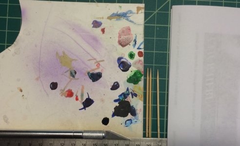
With the colors picked out, here are the tools needed for this project.
- Something to use as a Palette, I personally use Yupo paper, it is plastic, so it doesn't absorb paint. When it gets too dirty, hit it with some Alcohol and it will wipe clean. You can also use a CD/DVD case, wax paper, just about anything that doesn't absorb your paint.
- A Hobbby Knife to cut out the Color Isolator from your reference. I will show it's purpose here in a bit.
- Toothpicks are used to pick up small amounts of paint from the Palette and stir them in your paint cup.
- Scrap printer paper for test sprays. If you look at the image, my scrap paper is already printed on one side, instead of tossing my scrap printer paper, I use it for color matching and making temporary shields while painting.
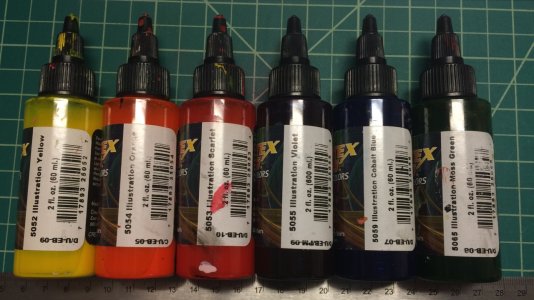
Here are the colors I am using for this project.
I am using Createx Illustration, but any type of paint will work fine.
For ease of matching, I am using Primary and Secondary colors, it makes the process even easier if you have the tertiary colors also, but since this is a simple project, these will be fine.
Now, lets look at the Color #1
The first step is recognizing the dominant Hue(color), in this case, it is Red.
Pick the first color that comes to mind and you will generally be right. Darker/Less Saturated colors are more difficult, but, they are also more difficult to tell if the color is off in the final painting.
Red alone is obviously way too Saturated for this color, Color #2 on the other hand is likely very close to a pure Red.
So, in order to kill the Saturation of the Red in my paint, I need to add it's complementary color. In this case, Moss Green is the closest thing I have. Moss Green is more of a Yellow/Green, for some reason CI paints don't have a pure Green.
Fir the first test spray, I put about 5 drops of reducer in my airbrush along with two drops of Red and one drop of Moss Green. The amount of drops is irrelevant, all I know is that there is more Red in the color we are looking to match, so it only makes sense to start with more of it. Put the colors in the brush and Back Flush a few times to mix the paint. It's important when mixing colors in your paint cup to put your reducer in first, if you put paint first, a bit of it sticks to the walls and just makes life more difficult.
At a first glance, the color doesn't look too bad, but it is way off. Spraying on a white piece of paper that is so far away from the reference may look ok, but they need to be compared and isolated for accuracy. In the reference image, I supplied a Color Isolator, which you should have cut out already.
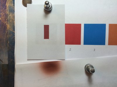
Now we can see the color comparison much better that we have isolated it from everything else.
The isolator can be used to put up to a reference image to isolate an area and these same techniques can be used.
What I see in this image is that once I get the isolator in place, that I've added too much Moss Green. The color is too dull. Straight out of the bottle, it was "Too Red" which means I have to add the Complement, now, it is "Too Green", or not enough Red. Generally, you need to look at a color and ask what needs to be killed, but isolation will help you see what is missing or it has too much of.
Note: When spraying on the test paper, I will spray a little, then put it under the isolator. If the color looks too light in value, just keep spraying and comparing until the paint is dark enough.
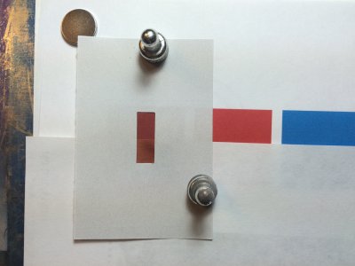
Now, as I get the color a bit closer, I see that there is a hint of violet. Lets all go back to 1st Grade for a minute and say "Hey Red and ???? Make Purple!!". If you haven't guessed by now , your education system has failed you.
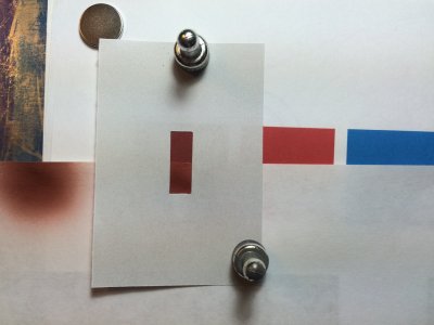
Now, since Blue is such a dominant color, If we put an entire drop of paint in the cup, it will completely obliterate what we have, so we need to add it slowly. Here I put a drop of Cobalt Blue on the Yupo that I'm using for the Palette. I pick up a bit of it on the tip of the toothpick.
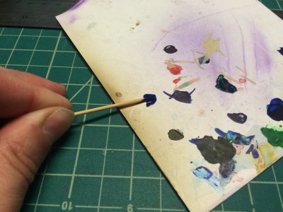
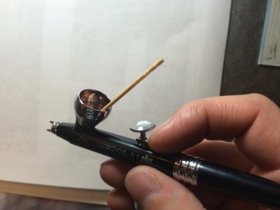
I then put it in my paint cup and stir it in with the existing color we are using.
And yes, that is my Go To Airbrush, which I dropped last night and almost had a heart attack. Luckily I only lost the Teflon Seal on the back of the nozzle.
Stir in the paint and Back Flush a few times to thoroughly mix.
Sh!t!!!, even with that tiny amount of Blue, I overshot my color.
It is now has shifted toward Blue Violet, so I need a bit more Red.
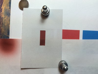
After another drop of Red, I am close enough that I would use this color. It's still could use just a bit more Red, but you get the idea.
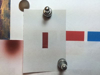
This particular color took me 4 tries to get close. If I were in Dru Blair's class, I would spend about another hour on this color and Dru would still tell me it's off.
Give all of these colors on this practice sheet a shot. It takes a bit practice, but you'll get the hang of it.
So many times on the forum, I hear the question about how to make "some color" it may be, Root Beer, Skin Tone, pretty much anything. When asking the question, everyone wants to know the "Recipe" for the color. These recipes never really work out because of the difference in pigment from one vendor to the next, hell, if you use the same paint, but don't shake yours well, the color won't be the same every time.
So.....how do you make Root Beer or a Skin Tone? Exactly the same way you make any other color...Match it!
Since the question was brought up in a recent thread, I will use a reference supplied by @Smiler65, it is a pretty simple image with only a few colors.
Step 1
Analyze the image for the darkest portion of a color, in the reference/practice sheet below, I have showed most of the key points to paint this image accurately with just transparent paints. There are 5 colors selected in the image, really, if I were to paint this, I would've done 7 colors. I would have added the darkest shadow of the T-Shirt and the other color for the shadow at the base of the heel of the shoe.

With the colors picked out, here are the tools needed for this project.
- Something to use as a Palette, I personally use Yupo paper, it is plastic, so it doesn't absorb paint. When it gets too dirty, hit it with some Alcohol and it will wipe clean. You can also use a CD/DVD case, wax paper, just about anything that doesn't absorb your paint.
- A Hobbby Knife to cut out the Color Isolator from your reference. I will show it's purpose here in a bit.
- Toothpicks are used to pick up small amounts of paint from the Palette and stir them in your paint cup.
- Scrap printer paper for test sprays. If you look at the image, my scrap paper is already printed on one side, instead of tossing my scrap printer paper, I use it for color matching and making temporary shields while painting.

Here are the colors I am using for this project.
I am using Createx Illustration, but any type of paint will work fine.
For ease of matching, I am using Primary and Secondary colors, it makes the process even easier if you have the tertiary colors also, but since this is a simple project, these will be fine.

Now, lets look at the Color #1
The first step is recognizing the dominant Hue(color), in this case, it is Red.
Pick the first color that comes to mind and you will generally be right. Darker/Less Saturated colors are more difficult, but, they are also more difficult to tell if the color is off in the final painting.
Red alone is obviously way too Saturated for this color, Color #2 on the other hand is likely very close to a pure Red.
So, in order to kill the Saturation of the Red in my paint, I need to add it's complementary color. In this case, Moss Green is the closest thing I have. Moss Green is more of a Yellow/Green, for some reason CI paints don't have a pure Green.
Fir the first test spray, I put about 5 drops of reducer in my airbrush along with two drops of Red and one drop of Moss Green. The amount of drops is irrelevant, all I know is that there is more Red in the color we are looking to match, so it only makes sense to start with more of it. Put the colors in the brush and Back Flush a few times to mix the paint. It's important when mixing colors in your paint cup to put your reducer in first, if you put paint first, a bit of it sticks to the walls and just makes life more difficult.
At a first glance, the color doesn't look too bad, but it is way off. Spraying on a white piece of paper that is so far away from the reference may look ok, but they need to be compared and isolated for accuracy. In the reference image, I supplied a Color Isolator, which you should have cut out already.

Now we can see the color comparison much better that we have isolated it from everything else.
The isolator can be used to put up to a reference image to isolate an area and these same techniques can be used.
What I see in this image is that once I get the isolator in place, that I've added too much Moss Green. The color is too dull. Straight out of the bottle, it was "Too Red" which means I have to add the Complement, now, it is "Too Green", or not enough Red. Generally, you need to look at a color and ask what needs to be killed, but isolation will help you see what is missing or it has too much of.
Note: When spraying on the test paper, I will spray a little, then put it under the isolator. If the color looks too light in value, just keep spraying and comparing until the paint is dark enough.

Now, as I get the color a bit closer, I see that there is a hint of violet. Lets all go back to 1st Grade for a minute and say "Hey Red and ???? Make Purple!!". If you haven't guessed by now , your education system has failed you.

Now, since Blue is such a dominant color, If we put an entire drop of paint in the cup, it will completely obliterate what we have, so we need to add it slowly. Here I put a drop of Cobalt Blue on the Yupo that I'm using for the Palette. I pick up a bit of it on the tip of the toothpick.

I then put it in my paint cup and stir it in with the existing color we are using.
And yes, that is my Go To Airbrush, which I dropped last night and almost had a heart attack. Luckily I only lost the Teflon Seal on the back of the nozzle.
Stir in the paint and Back Flush a few times to thoroughly mix.

Sh!t!!!, even with that tiny amount of Blue, I overshot my color.
It is now has shifted toward Blue Violet, so I need a bit more Red.

After another drop of Red, I am close enough that I would use this color. It's still could use just a bit more Red, but you get the idea.

This particular color took me 4 tries to get close. If I were in Dru Blair's class, I would spend about another hour on this color and Dru would still tell me it's off.
Give all of these colors on this practice sheet a shot. It takes a bit practice, but you'll get the hang of it.
