Taking the edge off of black

Karl Becker

Mac-Valve Maestro!
Getting back on topic here for a moment...

What I'm currently working on is a monochrome painting. Based on some instructional vids I've watched, I tried to warm up the black a bit by adding a little red. Trying to make it look less blue. That's the color I will be using for the remainder of this one because that's what I started with.

With that said, I was wondering what cocktails of color you guys/gals prefer for such an application? Also, why? What effect are you going for by doing so?

Thanks!

EDIT: This should probably be in the Color Help section. Sorry. Feel free to move it.
 
Last edited:

Adding red is a good option.
If you use magenta red you can add yellow to make it some orange red.
When I mix dark colors like this one.
I often take a drop of the color I am making on a piece of paper and mix in some white.
That makes it easier to see if I need to add some more or not.
The ready-made solution is.
Colden shading gray.
I like the graphite look.
 
it actually depends on what subject I want to paint in monochrome but I am nearly always using standard Etac efx colors except when I paint a baby in that case I use a warm brownish colour made from magenta , black and yellow
If I want a cold look I will use paynes grey or shading black if I want a warmer colour I use burnt umber . Sepia smoke is a bit of a wild card for me as it has a red/purple look to it and I mainly use it for full colour portraits
 
@Karl Becker Great post! I’ve wondered about this myself. Had a few times where “black” was not quite black and would shift blue or even green. May have been the lighting at times, but in one case it was the paper. Of course I was swearing a lot for a whole collection of other things too on that ‘piece’ before I consigned it to the blue bin.
Adding red is a good option.
If you use magenta red you can add yellow to make it some orange red.
When I mix dark colors like this one.
I often take a drop of the color I am making on a piece of paper and mix in some white.
That makes it easier to see if I need to add some more or not.
The ready-made solution is.
Colden shading gray.
I like the graphite look.
it actually depends on what subject I want to paint in monochrome but I am nearly always using standard Etac efx colors except when I paint a baby in that case I use a warm brownish colour made from magenta , black and yellow
If I want a cold look I will use paynes grey or shading black if I want a warmer colour I use burnt umber . Sepia smoke is a bit of a wild card for me as it has a red/purple look to it and I mainly use it for full colour portraits
@erwin de pan and @Ronald art Thank you for the suggestions :thumbsup:
 
For monochrome I always prefer a transparent sepia. With enough layers (like - a lot lol, but still) you can get to black with transparents. I prefer it to black or something like paynes grey which is colder.
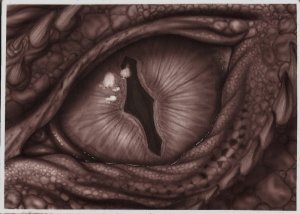
You can see on this old paint pal monotone pic I did many moons ago, you can still get some pretty deep colour building up layers. Might be something to play with, and see what you think. 12884-1489691319-7ba6a87899f3e6a614f59feec694886d.jpg
 
Golden Shading grey is awesome
But lately I have been using the Wicked Detail Jet Black and over reducing it for the grey areas.

But black will either have a blue tint to it or a brown depending on brand .
 
Back
Top